
This image is from a U.S. patent, applied for before the typewriter went to market, but it was definitely there on the first models.
 |
| Cropped from an image of the first typewriter model. |


These samples eliminate some suggestions that the key served some mechanical purpose, like advancing the paper, or as a shift key (which the first model lacked, as it could only type capitals).
The Sholes and Glidden typewriter (sometimes called the Remington No. 1) was the first successful typewriter ever brought to market (in 1873), and the forerunner of most other successful typewriters. The unidentified key was, as far as I can tell, on this model and only this model. It was gone on the Remington No. 2 introduced in 1878, never to appear again (in this form), and as far as I know never found on competitors either.
So what the heck is it? One option is to work the problem from the modern end, and see what's in Unicode. We find four characters that look like this:
- ⁝ - U+205D tricolon
- ⋮ - U+22EE vertical ellipsis
- ⫶ - U+2AF6 triple colon operator
- ︙- U+FE19 presentation form for vertical horizontal ellipsis
Some of these are a bit hard to parse. The vertical ellipsis makes perfect sense, as it is used to show several rows of ommitted information. But there's nothing in 19th century typography about vertical ellipses, and I haven't even found them in use yet. Besides, with such a limited keyboard, lacking so many basic characters, why provide this when the colon could serve a similar purpose? Even if this existed back then, I don't think this was the purpose on this keyboard. “Tricolon” appears in 19th century sources as a name for one type of verse structure found in the bible, so that isn't so helpful. “Triple colon operator” unsurprisingly turns up many pages of medical sources, but I found nothing about symbols, characters, etc.
So really Unicode was no help to me.
Next, Marcin Wichary found this character in On the Prehistory of QWERTY.

This is a paper I know well, and have many problems with. It promotes a new theory that the QWERTY keyboard layout is based on preventing transcription errors by telegraph operators receiving messages. Given that I've pretty much proven that typebar jams were the primary design goal of QWERTY, we already have problems. I've promised to write a more thorough debunking of their claims, but it's still on my to-do list.
At any rate, this new claim links to that idea. The idea here is that telegraph operators needed a way to transcribe the telegraph code for “new paragraph”. I have confirmed that this telegraph code does predate the typewriter, dating back at least to 1854, but there's still a big problem with this notion. Our mystery symbol was clearly intended to be typed, however the person transcribing incoming telegrams could just make a new paragraph on receipt of that code, rather than typing a special character. There appears to be no reason to ever put the symbol on paper. It's also problematic because it is an incredibly usage-specific character, on a machine that didn't even include parentheses.
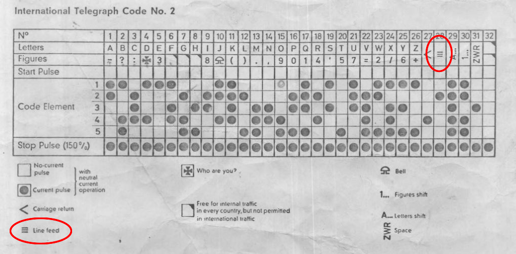
I did find a vaguely similar usage of a vaguely similar symbol, in the International Telegraph Code No. 2, which was approved by the CCITT back in 1932. Many sources use a particular symbol for the line feed character, which looks somewhat like our mysterious three dots, as seen in this document:
A few days ago, the Shady Characters blog picked up this story and ran with the paragraph separator idea that I tend to discredit. This was followed by a great discussion in the comments section of all sorts of different ideas on the origin, but perhaps the most interesting tidbit came in when a typewriter expert mentioned that his Remington No. 1 produced a slash “/” when this key was typed, rather than three vertical periods. He referred to it as a “virgule”, which left me a bit confused, as I have Google Books permanently locked in to the 19th century, and the meaning of virgule during that time was just the french word for comma.
So virgule was a dead end, but then Keith Houston who runs Shady Characters (and published a book by the same name), added that it's also called a “solidus”, which lead me to find out that it was even more commonly called a “shilling mark”, and was used in currency, where you'd write “5/” for something that cost 5 shillings, and 5/8 for five shillings and 8 pence (although if something was 3 pounds, 5 shillings, and 8 pence, you wouldn't use / in that case you'd write “£3 5s 8d”, or “£3,,5,,8” or a few other choices). This was interesting, but it hardly explained why typewriter inventor Christopher Latham Sholes and his cohorts would put a shilling mark on a keyboard that doesn't even have a dollar sign (although you can make a dollar sign by combining S and I). British currency did last a long time into the 19th century in the United States, but it was certainly not the dominant currency by the time Sholes designed the typewriter.
Moreover, three dots are not a shilling mark, so clearly this was not its initial intent. But the original three dot pattern did seem to have some kind of relationship with the shilling mark, so I kept digging.
Then I found something really interesting:
 |
| The American Bookmaker, September 1887 |
The text above is describing a book called Bibliotecha Hamiltonia, published in 1886:

The slash is being used as a representation for line separators. I've seen similar usage for condensing a few lines of a poem into a single line. So here in 1886, we have slash meaning the same thing that three vertical dashes meant 45 years later in the 1930s. Well, kind of coincidental, but not that exciting. But there was also this note that the “inclined strokes” were used in place of the more common “dashes turned sidewise”. Like a vertical bar, maybe? And so, I was able to find in fairly short order, a vertical bar used like the slashes used in the above bibliography.
 |
| A Century of Printing / The Issues of the Press in Pennsylvania 1685-1784, 1886 |

This is the same three dot symbol used by Sholes on his typewriter, in a context where it is used identically to a slash, also used on the same typewriter by the same key. In this case, the three dots (which they call here “dotted lines”) are used to show an alternate set of line breaks. This seems to be a less common usage than the vertical line for this purpose.
This leads me to the following working theory. Sholes, or one of his testers, wanted a vertical bar character on the typewriter for situations like this one, with a bibliography. It could be useful for borders and other things too. But the typography of that first typewriter was stone simple. It was a sans serif font, and the letter “I” was already a vertical bar. Given that Sholes doubled up “1” and “I”, there's no point in adding a relatively obscure symbol that was identical. To be useful it would have to look different than an “I”. So Sholes simply used an existing alternate form. Later, when it turned out to be less useful, it was changed to a slash which carried the same function, but could also be used to write fractions, and the percent sign, and to double up with “c” to make “¢”, as well as a number of abbreviations common in that era that used a slash.
It's not a perfect theory. I have no smoking gun, and I still find some issues with this theory. But right now, its the best thing we've got that (now) has actual evidence behind it.
The biggest problem is that this is still a relatively obscure usage. Yes, Sholes was a trained compositor, and would likely have been familiar with all of these symbols, but you'd think he'd also realize these are relatively obscure symbols. The first keyboard had no at sign, number sign, no parenthesis or brackets, no equal sign, no asterisk, no percent. This usage doesn't seem to justify this key. Perhaps there are other usages for the same group of symbols?
One of the big contributors to the development of the typewriter was James O. Clephane, a court reporter who became their best product tester and critic. His testing lead to a rapid series of changes in design to make the machine more reliable and easier to use. Perhaps this was a common and essential symbol used in court reporting? I've searched a bit but come up empty, but it's definitely worth pursuing further.
Still this is all very intriguing. Is that 1930s document related to this? It seems to carry the exact same meaning. And it's only 55 years later, still within the memory of some. If I'm on the right track, this mysterious key could have lead to the inclusion of slash on the keyboard and in ASCII, and as well as both the vertical bar, and the broken vertical bar (which was created for ASCII in the 1960s to avoid confusion with the mathematical “or” operator).
There's even a tie-in with the pound sign. In part two of my examination of that character, Britain on Hash, one of the possible-but-unlikely origins of the name hash for the pound sign was a practice of using slashes and dashes in a new piece of computer technology called KWIC indexing, where the separator usage of slashes and dashes seems very much related to this old usage.
The “lost” key might not be lost at all, just changed over time.
Of course we have to be realistic. This is all just guesswork — the ramblings of a madman. The only thing we can really say for sure, which is still a step forward, is that a symbol just like the original three dot typewriter symbol was used to indicate line separations in typography, and that this symbol was replaced on the keyboard with a slash, which was also used in typography for the same purpose.
The truth may still be out there. There is supposedly an original catalogue that came out with the first Remington typewriter, a multipage pamphlet called The Type-Writer: A Machine to Supercede the Pen, which may well describe this key and its purpose. So far all I've been able to find are simple single-page ads with that text.
Update: November 2019
In April of this year additional information came to light from Eric Fischer in a Twitter thread (started by Mr. Wichary) suggesting that the symbol was a substitute for parenthesis and braces. The source provided is from 1887, by which time I would have thought the key had already been replace. Wichary says he found another source that backs this up, but also suggest that the tricolon could be used as a combining character with S to make a dollar sign—though he rightly questions why you wouldn't just combine with the "I" as was common known practice, and which was even mentioned in his source.
I had found an early hint that this key was in fact meant to be used a both left and right parenthesis, and even though I tweeted about it at the time, didn't think it was likely enough to merit a mention in this article. Yet another lesson that you should always include everything.
Thomas, you may have missed the bit I added in a March 6 comment on Keith's Miscellany No. 70 post (subsequent to your last comment there) . The illustration I have of the No. 4 keyboard shows a pipe in that position. This lends some credence to your argument in favor of a line separator for bibliographic work. Maybe librarians were an early market for the type-writer (think card catalogs).
ReplyDeleteI've got your answer to the mysterious vertical tri-dot break.
ReplyDeleteYou're right that it's a bibliographical symbol.
Vertical bars indicated a line-break in an article title or in a newspaper's header. The vertical dots are an ellipsis indicating when a newspaper's crest or central logo was eliminated from a quotation.
Basically, it would be like a hypertext mark indicating a placeholder for graphics or text that would be too unwieldy to reproduce in a bibliography.
See this link to the "Freemen's Journal or The North American Intelligencer": https://www.newspapers.com/title_1238/the_freemans_journal_or_the_northamerican/
Click on the picture of the front page to enlarge. You'll note that the logo also included information such as the bound volume number and individual sale price.
My guess is that leather-bookbound volumes of newspapers did not always spell out the newspaper name on the spines, but may have used stamped foil crests on their covers to indicate they were part of a reference archive. In most cases, the individual newspaper editions and their numbers and dates would have been more relevant for citation. The volume numbers would have had more relevance for librarian reshelving purposes.
This comment has been removed by a blog administrator.
ReplyDeleteHere is an interesting bit of information--and from Wikipedia no less:
ReplyDeletehttps://en.wikipedia.org/wiki/Typewriter#/media/File:Sholes_typewriter.jpg
It show a prototype Sholes Glidden typewriter--one of many, apparently--from 1873.
What is interesting in this prototype is that pretty clearly on the key where the three vertical dots appear in your photo above, is NOT three vertical dots but rather a vertical line.
In my mind that helps clarify the theory that they were first including the vertical line as a commonly used symbol for a paragraph break. But at some point they probably realized that the sans-serif I is also a vertical line. So why have two nearly identical symbols? And they changed it to the three dots, which is similar and fits on a similar shaped key for the imprint, but is different and can't be easily made otherwise.
Somewhat related, I notice that the far left and far right symbols on the keyboard are tall and thin--on the left the vertical bar at first, later replaced by the three vertical dots, finally replaced by the slash which is also pretty tall & thin. On the right, the colon, which is tall and thin.
It makes me wonder if there was not some reason it was advantageous for the extreme ends of the mechanism to have narrow characters. Perhaps the very end typebars fit in place better or rotated out to strike the ribbon better if they were thin. Looking at the Scholes & Glidden mechanism, I can't see why this would be so. But it is hard to get a precise idea of how the mechanism worked without a sample to inspect carefully.
Another possible reason colon & three-dots ended up on the edges of the keyboard is simply that the middle part of the keyboard was already set according to their scheme for avoiding letter entanglements, and the colon & three-dot symbols were relatively late additions.
This prototype from 1872, for example, has all the qwerty keys in the center but lacks both the colon & three-dot:
https://en.wikipedia.org/wiki/Sholes_and_Glidden_typewriter#/media/File:Sholesglidden3.png
Regarding vertical ellipses, they're commonly used in mathematics. I have no idea if they were in use back then (and this symbol is clearly not that anyway), but they are in fact in current use.
ReplyDeleteThe information provided by Brent Hugh suggests another idea to me. The form of the vertical dots glyph may be realized, by purely subtrative means, from the vertical bar glyph. The typebar corresponding to a vetical bar may therefore be modified to produce vertical dots via a few deft strokes of a file (or other instrument of metal removal). Perhaps the vertical dots were created contemporaneously, when the redundancy with the 'I' character was realized? Do the three dots of the glyph in question show meaningful of variations compared to the dots of the colon symbol?
ReplyDeleteWhereas most people are using the terminology line separator, I would say this is a line terminator.
ReplyDeleteI don't know much about the history of typing machines, but I do know about engineering. I know that sometimes someone's agenda works its way into shipping products in subtle or surprising ways - especially in early versions of a product. To me it's telling that the key was removed pretty quickly from subsequent models. Perhaps the symbol was obscure, but the creators of the device simply preferred it to the alternatives.
ReplyDeleteThis comment has been removed by the author.
ReplyDeleteIt's to replace omitted text, similar to [..], but always used as a single character on a line by itself.
ReplyDeleteI am kidding.
Or I am very old.
Take a guess.
When I used to work on a college newspaper in the 1970s, copy editors drew vertical lines to enclose any text that would be in italic when typeset. In those days, there was no keyboard "pipe" or "rail" symbol on a typewriter. However, the key on the early computerized typesetting machine itself that engaged the italic type font was marked with the word "Rail." We used the word "rail" in conversation to mean "in italics."
ReplyDeleteIt may have been handy for professional newspaper writers and authors -- who would have been a significant part of the market for early typewriters -- to have a vertical mark on the typewriter keyboard, so they could indicate which words should be in italic, without trying to remember to hand-mark them afterward. Three dots would stand out more easily than something that might look like a 1 or l. (The hand drawn rails extended above and below the line.)
But the dotted symbol would not appear in the finished printed page, only the italicized word. The rare cases you've found of the vertical dots appearing in print to be showy, like a MySpace page full of emojis, don't seem to be enough to explain a key existing on a typewriter keyboard with such limited real estate.
as far as computers go, I would have prefered the use of ⁝ over / or \ in directory structures. allowing slashes in file names would be so useful to me.
ReplyDeletec⁝DOS⁝com/UTIL⁝fdisk.exe
c⁝DOS⁝com/PROG⁝edit.com
c⁝DOS⁝com/DEV⁝qbasic.exe
user⁝home⁝Bob's and/or John's file.txt
or, for that matter:
Deletehttp⁝⁝widespacer.blogspot.com⁝2016/03/01⁝the-lost-key-of-qwerty.html
Telegrams used to be transcribed onto paper strips that were glued down. The paragraph separator would have been useful in these.
ReplyDelete